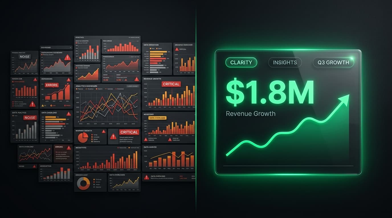
A great operations dashboard shows only the metrics that drive decisions, pulls them from one connected source in real time, and arranges them on a single screen you can read in about five seconds. The best ones don't just report what happened — they make the next action obvious.
Every business owner has seen a dashboard that dazzles in the demo and gathers dust by week three: forty charts, six colours, a live map, and almost nothing you can act on. A great dashboard is the opposite. It's the instrument panel of your business — the small set of dials a pilot watches to keep the aircraft level — and everything that isn't a dial has been left off.
This guide breaks down what separates a dashboard people open every morning from one they quietly stop looking at: nine principles, drawn from decades of data-visualisation practice and grounded in how South African businesses actually make decisions.
What is an operations dashboard?
An operations dashboard is a single screen that shows the live metrics a team needs to run the business day to day — orders in progress, cash in the bank, tickets open, deals about to close — so the people responsible can see the state of play at a glance and act on it.
The definition worth committing to memory comes from data-visualisation pioneer Stephen Few: a dashboard is "a visual display of the most important information needed to achieve one or more objectives, consolidated and arranged on a single screen so the information can be monitored at a glance." Three phrases in that sentence do all the work. Most important information — not all information. Single screen — no scrolling, no hunting across tabs. At a glance — you read it, you don't study it.
That last phrase is what separates a dashboard from a report. A report is something you sit down and work through; a dashboard is something you take in while walking past. Confusing the two is the most common reason dashboards fail — they get built like reports, crammed with everything, and then nobody has the ten minutes it takes to decode them.
Great dashboards start with a question, not a data source
The instinct when building a dashboard is to ask, "What data do we have?" and put all of it on screen. That's exactly backwards. The first question is always, "What decision does this screen need to support?"
Design from the decision and work back to the two or three numbers that inform it. An operations lead checking whether today is on track needs open orders, capacity used and anything overdue — not last quarter's marketing spend. A founder deciding where to spend the next rand needs cash, pipeline and margin, the way an executive dashboard pulls every division into one view. When every widget traces back to a real decision, the clutter removes itself — anything that doesn't inform a decision has nowhere to sit.
The five-second test: can you read it at a glance?
Here's a test worth applying to any dashboard: show it to someone for five seconds, take it away, and ask what the single most important thing on screen was. If they can't tell you, the design has failed — not the viewer.
Passing it comes down to visual hierarchy. A reader's eye lands top-left first, so that's where your most decision-driving number belongs — biggest, boldest, impossible to miss. Secondary metrics step down in size to the right and below. Related figures group together; white space, not borders, does the separating. Done well, the layout itself tells the reader where to look. Done badly, everything shouts at once and nothing is heard.
How many metrics should a dashboard have?
Fewer than you think. Human working memory holds only about seven items at a time — the well-known "seven, plus or minus two" — and a dashboard that ignores that limit stops being read. The practical consensus among designers is five to nine visuals on a single view, anchored by a handful of primary KPIs. Everything else lives one click away, in a drill-down or a secondary tab.
The discipline this demands is choosing what to leave off, and it's the hardest part of dashboard design. The table below is the litmus test.
| A great dashboard | A busy dashboard |
|---|---|
| Answers one clear question | Tries to show everything at once |
| 5–9 focused visuals | 20+ competing widgets |
| Live data from one source | Stale exports stitched together |
| Colour used only for exceptions | A rainbow of decoration |
| Points to the next action | Leaves you to work it out |
If your current dashboard sits in the right-hand column, the fix is rarely to add a filter. It's to take things away.
Real-time data, or it's just a history lesson
An operations dashboard reporting last week's numbers isn't an operations dashboard — it's a history book with charts. The whole point of watching operations is to catch a problem while you can still do something about it, which is only possible if the data is live.
Live data depends on one thing above all: a single source of truth. If your dashboard is fed by a spreadsheet somebody exports and pastes every Monday, it's out of date by Tuesday and wrong by Friday. If it reads directly from the systems where the work actually happens — sales, finance, operations, support — it's simply always current. This is where a connected business operating system earns its keep: because every division writes to the same live data, the dashboard doesn't have to be assembled, it just reflects reality.
In South Africa this matters more than most design guides admit. Cash flow is repeatedly named the single biggest threat to local SMEs — not because businesses aren't profitable, but because corporate and government payment cycles routinely stretch 90 to 150 days, so money owed and money in the bank drift far apart. A dashboard that surfaces live cash position and ageing receivables straight from your tax-compliant accounting turns that risk from a month-end surprise into something you see coming weeks out.
See your business on one screen. A short, no-obligation discovery call is enough to map the handful of metrics that actually run your operation — and where they live today. We'll show you what a single, live view would replace.
The right metric deserves the right chart
A number chosen well and drawn badly still fails. Matching the metric to the visual is a craft, and the rules are simpler than they look. Use a line chart for anything moving over time — revenue by week, tickets by day — because the eye reads the slope as a trend. Use a bar chart to compare distinct categories, such as sales by region or product. For a single headline figure like total revenue or active users, a large number beats any chart, but never show it naked: pair it with a small trend line or a "versus last month" comparison so the reader knows not just what the number is, but whether it's good.
Colour is a language, so speak it sparingly. When every widget is a different bright shade, colour means nothing. Reserve it for status — green for on track, amber for at risk, red for behind — and suddenly a glance tells you where to look. A dashboard where colour only ever signals an exception is a dashboard whose problems announce themselves.
A great dashboard ends in an action
The final test of a dashboard isn't whether it's accurate or attractive. It's whether looking at it changes what someone does next. A metric that can't be acted on is trivia, however precisely measured.
This is why the strongest dashboards pair every important number with a path to act. A red figure a viewer can click into — to see which deals stalled, which invoices are overdue, which orders are late — closes the loop between noticing and doing. Watching your sales pipeline helps only if a stuck deal is one click from the follow-up that unsticks it. And the best dashboards don't wait to be checked: they alert you when a number crosses a line you care about.
Operations dashboard vs executive dashboard: what's the difference?
"Dashboard" covers a few different jobs, and building the wrong type is a common mistake. The three that matter for most businesses answer three different questions.
| Type | The question it answers | Time horizon | Typical user |
|---|---|---|---|
| Operational | "What's happening right now?" | Live / today | Ops managers, team leads |
| Executive (strategic) | "How is the whole business tracking?" | Weeks to quarters | Owners, directors |
| Analytical | "Why did it happen?" | Historical, exploratory | Analysts, finance |
An operations dashboard is built for immediacy — refreshed constantly, watched by the people keeping today on the rails. An executive dashboard zooms out, trading minute-by-minute detail for the trends and totals a leader steers by. You need both, but not on the same screen: mixing "an order is late" with "are we hitting the quarter?" serves neither. Great design starts by being honest about which question the screen is for.
Who sees what: access, security and POPIA
A dashboard concentrates your most sensitive numbers — revenue, margins, sometimes customer personal information — into one place, which makes access control a design decision, not an afterthought. A great dashboard shows each person exactly what their role needs and nothing it doesn't. The floor manager sees today's operations; the finance lead sees cash and margin; a client-facing rep sees their own accounts, not the whole book.
Under POPIA, this is also a compliance matter. Any dashboard surfacing customers' personal information has to respect who's allowed to see it, so role-based access isn't a nice-to-have — it's part of doing this properly. A platform that builds permissions in from the start makes it straightforward; a spreadsheet emailed around the office makes it impossible.
Should you build or buy your dashboard?
Once you know what a great dashboard looks like, the practical question is how to get one. There are two honest routes.
For most growing South African businesses, the fastest path is a ready-made executive dashboard inside a platform that already runs your sales, finance, operations and support. Because the data is unified from day one, the dashboard is live immediately — there's nothing to wire together. That's the "buy" path: connected, current and quick to stand up.
When your operation turns on metrics no off-the-shelf product tracks — a production process, a logistics model, a way of measuring that is your edge — custom software fits better. A dashboard built to your exact process, reading from the systems you already rely on, means the screen bends to your business instead of the other way around. Many businesses do both: a unified platform for the common view, a bespoke dashboard for the part that makes them different.
Want a dashboard your team actually opens every morning? Book a free, no-obligation discovery call with Syniq. We'll map the handful of metrics that run your business, show you where they live today, and lay out the fastest path to seeing all of it on one screen.
Frequently asked questions
What is an operations dashboard? An operations dashboard is a single screen that displays the live metrics a team needs to run the business day to day — such as orders in progress, cash position, open support tickets and deals about to close — so the people responsible can see the current state at a glance and act on it immediately.
What makes a good dashboard? A good dashboard answers one clear question, shows only the five to nine metrics that inform a decision, reads from a single live data source, uses colour only to flag exceptions, and can be understood in about five seconds. Above all, it points the viewer toward a next action rather than leaving them to interpret.
How many metrics should a dashboard have? Usually five to nine visuals on a single view, anchored by a handful of primary KPIs. Human working memory holds only about seven items at once, so more than that reduces clarity rather than adding it. Extra detail should live one click away in a drill-down or secondary tab, not on the main screen.
What is the difference between an operations dashboard and an executive dashboard? An operations dashboard answers "what's happening right now?" — it's live, detailed and watched by team leads keeping the day on track. An executive dashboard answers "how is the whole business tracking?" — it zooms out to trends and totals over weeks and quarters for owners and directors. You need both, but on separate screens.
Should a business dashboard use real-time data? Yes, for operational metrics. The purpose of watching operations is to catch problems while you can still fix them, which only works if the data is current. Real-time data depends on a single source of truth — the dashboard reading directly from the systems where work happens, rather than from spreadsheets exported and pasted by hand.
How do I choose the right KPIs for a dashboard? Start from the decision the dashboard needs to support, then work back to the two or three numbers that inform it. If a metric wouldn't change what anyone does, leave it off. Pair every headline number with context — a trend line or a comparison to last period — so viewers can tell not just what the number is, but whether it's good.